A graph is a visual representation of the occurrence of a behaviour over time. There are six main components of a graph:
1. y-axis (vertical) and x-axis (horizontal)
2. Labels for the axis (e.g., days, hours spent studying)
3. The numbers on the y and x axis
4. Data points
5. Phase lines (indicates change in treatment) 6. Phase labels (e.g. baseline)
The horizontal axis of a graph is known as the x-axis. When you look at the x-axis, you are usually looking at something that represents time. This most commonly the date on which data was collected but can also sometimes be used to label successive sessions.
The vertical axis of a graph is known as the y-axis. When you look at the y-axis, you are usually looking at something that represents a measure of a behaviour (e.g. frequency, duration of the percentage of intervals in which a behaviour occurred).
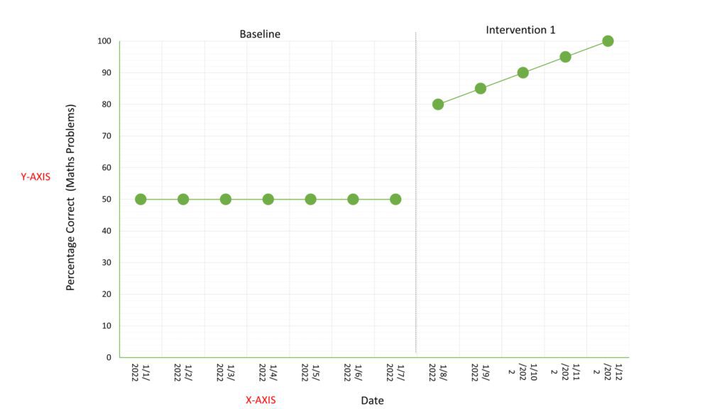
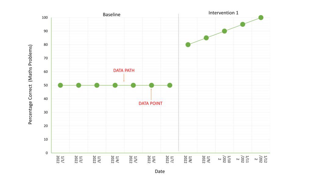
Data points are the dots that represent the number of a behaviour on a specific date or sessions. The line that connects two data points, is known as a data path.
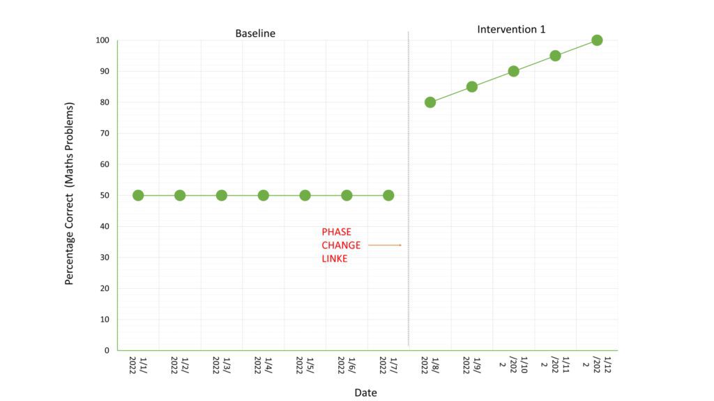
A phase change line represents a change of some sort. In the current example, the ABA team collected baseline data (i.e. they measured the occurrence of the behaviour of interest before the intervention). They separated the baseline data, from the intervention data using a broken line known as a phase change line. This allows us to more easily identify the impacts of an intervention. It is also important to label different phases prior to, during and after an intervention. If alterations are made to an intervention, it is also important to draw a phase change line.
When graphically analysing data there are three main factors that we look at:
- Level
- Trend
- Variability
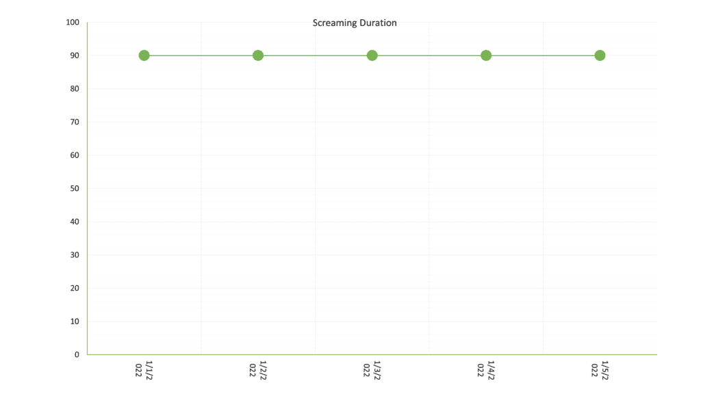
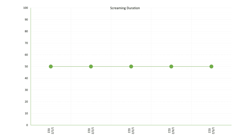
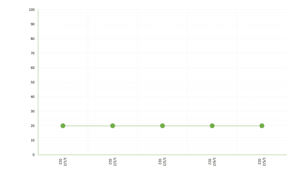
The level of the data relates to the ?position? of the data set taken from the Y-axis. Look at the graphs below; in the first graph if the plotted data points fell into the top section they would have a ?high level?, if they fell into the middle section they would have a ?moderate level? and if they were in the bottom section they would have a ?low level?.
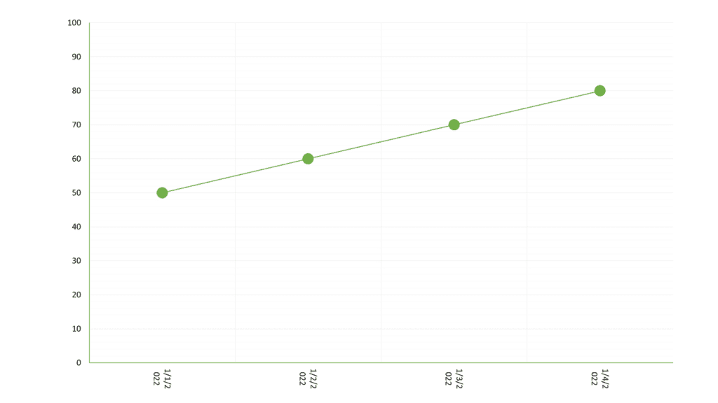
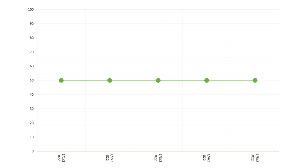
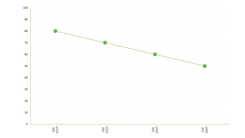
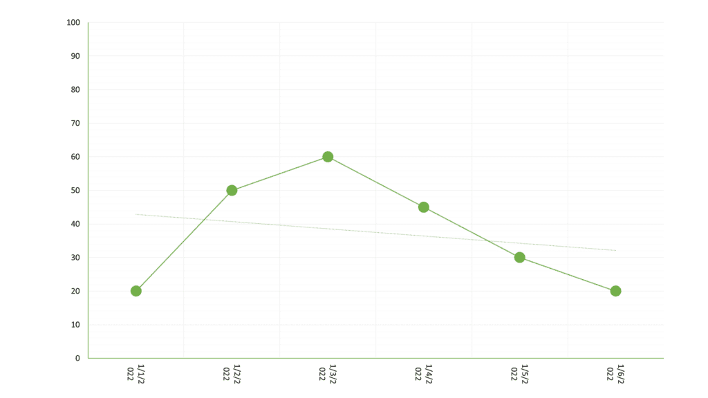
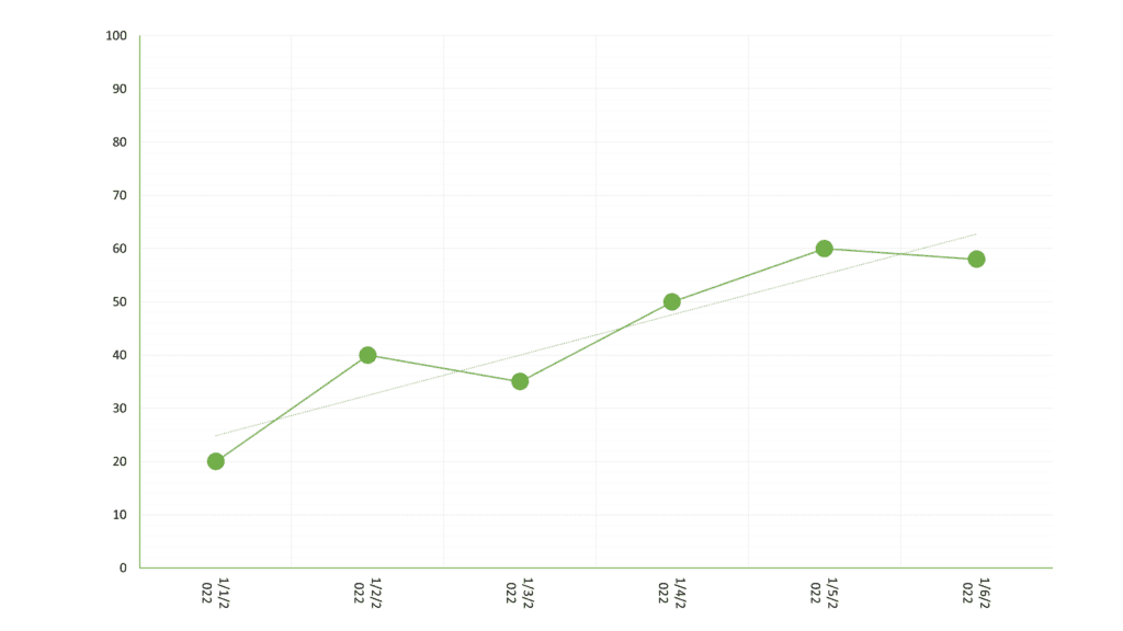
The trend in the data is the ?direction? it is going. For example, in the graphs below, the first graph shows an ?increasing trend? as the data points are ?going up?. The second graph show a ?decreasing trend? as the data points are ?going down?. The third graph set shows a ?zero trend? because the data are not going up or down.

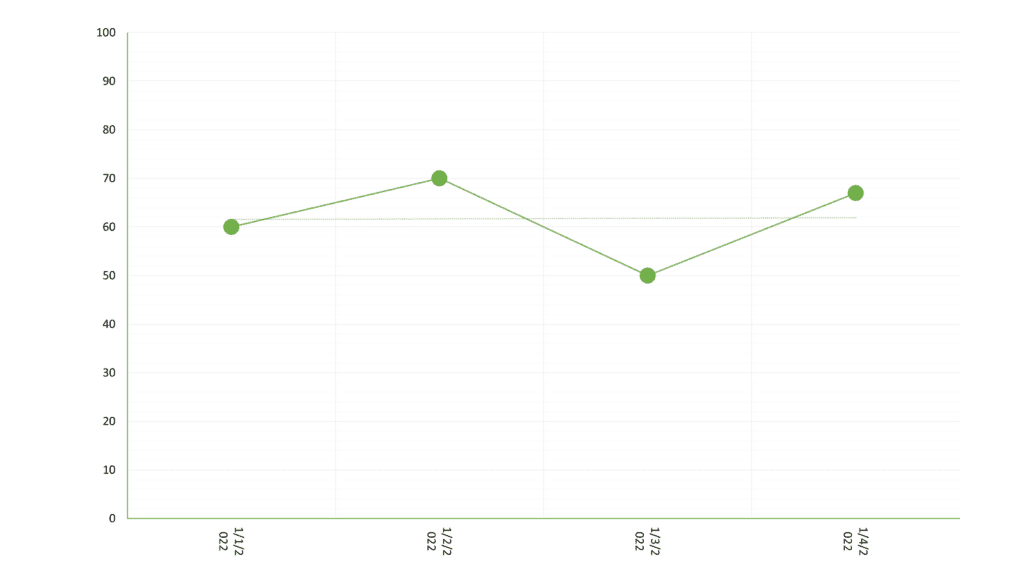
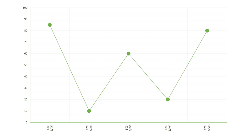
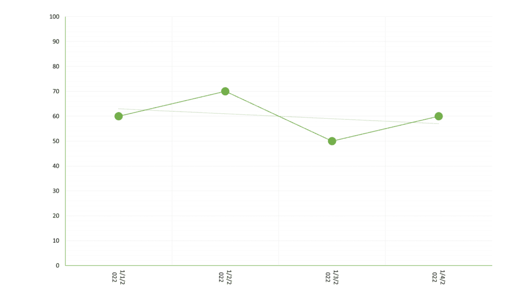
Variability relates to how different or ?spread out? data points are from each other.
In the first graph below, the data is “stable”. However, in the second graph, the data is highly variable as the data points are spread out from each other.
As a behaviour technician, your supervisor will provide you with decision-making protocols ? rules that must be followed with regard to continuing, stopping or altering an intervention. Such protocols often incorporate the concepts of level, trend and variability.
For example, if your supervisor told you to continue with an intervention if you had three ascending data paths, you would continue in the below scenario.

Likewise, if they told you to stop after three descending data paths, you would stop in the below scenario:
Similarly, you might be directed to stop if there is no trend across three data paths
A protocol might tell you to seek input from your supervisor after five data paths, if the data was variable, at a low level or descending.
But it might also tell you to continue implementing an intervention, if the trend was ascending and the data was at a moderate or high level.
While the rules given to you by your supervisor may be different from the above examples, they should show you how we can use data and graphs within decision-making protocols to personalise our teaching in an objective manner.